Food Photography Tip of the Week |19|
DIY Food Photography Backgrounds!
Or, I should say, experimentation in making DIY photography backgrounds. This was really my first attempt at building and painting backgrounds. I’ve been using old fence posts for a few years now but they’re sort of a pain [very dirty/dusty] and sometimes show too much texture, especially for overhead shots. I also have a few large tiles that I like to use, a few pieces of MDF that I painted solid colors, and of course random pieces of fabric.
As soon as I started making my first thought was, “Whyyyyyy has it taken me so long to do this???” Totally complaining to myself. Do you ever do that?
They’re really pretty easy to put together, hard to completely screw up, and very affordable. While a circular saw was helpful to cut the longer lengths of board I bought a smaller hand saw would definitely do the trick, or you can typically get them cut right in the store.
*FYI – These are mostly iPhone shots except for when you see the raspberries at the end.

Materials for building photography backgrounds:
Wood: There are really so many different options on the type of wood you can use. It really depends on what look you’re going for and how much you want to spend. I wasn’t really sure my first time around so I experimented.
- Blue Stain Pine – I liked this board because of the pretty wood grain and that it was tongue and groove. The board is 1x6x8 and just over $5. It’s hard to tell from the photos but the cool thing about this board is that on one side each 6-inch width is smooth and on the other there is a groove in the center that makes it look like it’s made up of more planks [the side shown above and below].
- Basic Pine Tongue and Groove Board – I can’t find the exact type of wood I used for the other board [below] I bought but they were 1x4x8 and also about $5. I cut them to about the same length and glued them together in about 10 minutes total. After they dried I moved on to painting.
I cut the boards into 2 foot lengths.
*You definitely do not have to use tongue and groove wood. You can use any width boards you like but I do recommend making surfaces at least 2’ x 2’ in size. If you’re not using tongue and groove you can still secure the edges with wood glue but you’ll want to clamp them each until dried which will take a lot longer. The other option would be to run 2 pieces of wood on the edges underneath the planks and nail those strips in from the back. Just be sure to use a the right length nail so they don’t come through the top layer.

Wood Glue: If you’re using the tongue and groove style wood boards wood glue is perfect for securing your boards together. Refer to the instructions on the back for details in how to apply and for dry times. The glue I used below took about 30 minutes to securely dry.

Paint: Buying paint samples is the best option for this! I highly recommend trying to get “flat” paint because you most likely do not want a shiny surface. Shiny surfaces can create harsh shadows that you most likely want to avoid. If flat isn’t an option get the lowest sheen possible, or check another store. Home Depot had flat paint available in the sample sizes. I picked out 7 earth tone shades and they each cost under $3. If you are just making one background 1 or 2 samples would be fine! I just wanted to experiment with colors. You will use a very minimal amount of paint so the sample size is perfect!
Sponge brushes: The sponge brushes are extremely helpful if you want to create a “stain” look with your paint. You’ll dilute the paint with water, brush the mixture on, and then wipe it off with a paper towel, creating a stain-like look. These cost under $1 each and I got a few so I didn’t have to keep washing them when I switched colors.
Paint brushes: If you want to create a streaked, weathered look then pick up a paint brush that’s about 1 1/2 or 2-inches wide. You don’t need anything fancy so it should only cost a few dollars.
Cups: I used a few disposable cups for mixing the paint + water. Easy + cheap.

Painting Photography Backgrounds:
For the first round I started with the 3-inch wood planks that were glued together and fully dried. There is really no one right way to go about painting your boards. It’s all about experimentation!
I took the darkest brown color and mixed it with water at a 1:1 ratio. [For a lighter washed look just add more water.] I dipped the sponge brush into the cup and painted each board. This took about 30 seconds and then I immediately followed up by wiping each board with a paper towel. [Not scrubbing, just wiping them down.] After wiping them with the paper towel [an old cloth towel will also work] the board looked like the photo below.
Doesn’t it look like stain? Nope, just paint + water and it dried in about 10 minutes since I was doing this outside.
Note: The amount of paint you need to use is minimal. When you do the paint wash [below] you probably need about 2-3 tablespoons of paint because you’re also going to add the same amount [or more] water. And to add the weathered look on top you’ll dip just the tip of the brush into the paint jar and lightly brush it on. There will be plenty of paint leftover even after making a few backgrounds.

While I LOVED the look of these boards I felt like I should experiment more, so I started layering colors on top. I kind of regret that decision as I think I liked the stained look the best. However, now I know how easy it is to make another board to get this stained affect.
I took the lightest creamy brown color I had and diluted that to about 1 part paint : 2 parts water and washed that over the wood and wiped it again as I did with the brown.

I wasn’t sold on the ghostly look it created [not photographed] so then I started to lightly brush color over top with a paint brush and two different colors.
To create a weathered/streaked look: First make sure your base wash color is completely dry, if you’re starting that way. Next, pick which color[s] you’re going to use. Dip just the very tips of the brush into the paint if you only want light streaking [no need to pour this paint into a cup]. Start lightly brushing in the direction of the grain over one plank at a time. Stop when you think you have enough and wait for this layer to dry. If using another color layer it over top and repeat until you’re happy with the look.
I had multiple layers on this board over the initial wash from above. It was fun to keep layering the paint on but just beware you will start to lose some of the wood grain the more you layer.

This was the end result below [taken with the fancy camera]. You can see the lighter wash color I added on top of the first dark brown and then the two different colors of brown I streaked on with the paint brush.

The bright sun is not too friendly for photos so I blocked most of it by putting a few pieces of foam board in the tree. Worked like a charm and I could see the paint colors better as well.

For board number two I knew I wanted to paint both sides. I started with a very light paint wash on the side with more grooves. I first added the white paint with just a touch of brown and then added in the same ratio [or slightly more] of water.
Just like the first board I brushed it on with the sponge brush and wiped it off with the paper towel. You definitely want to brush and then wipe pretty quickly to achieve the washed look.

Here is what it looked like as I painted the first few planks and wiped them. I did this a few times to build up a bit more color and hide some of the natural blue in the wood.

After that board dried I flipped it over to paint the other side. This side only had grooves every 6-inches where I connected the boards together. The other side had a groove in the center of the 6-inch width. You can better see what I mean if you check out a photo of the board here.
For this side I started with a lighter color wash and then layered 3 or 4 colors on top with the paint brush. I used white, two shades of brown, and a dull gray/blue.
Again, I just kept layering the paint until I liked the way it looked. If you wanted more of a solid color look then you would just keep adding the same color until it was filled in to your liking.
[fancy camera shot]

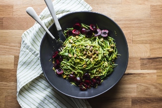
I did a quick photo shoot with raspberries just to show you how the boards ended up looking. The photo below was taken with backlight and sidelight [from the left].

I wasn’t loving how the board looked above but when I blocked the sidelight it added more shadow and really changed the feel of the photo. I also used a shallower depth of field to blur the board a bit more. I think I would like a few even darker brown streaks on this board.

I wasn’t totally sold on the colors at first but it’s definitely growing on me. I do like this shot with the raspberries right on the board. With the old wood fence posts I was using sometimes the intense texture of the wood competed too much with the food I was photographing. This smoother board allows the food to stand out much more.

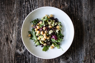
Here is what the finished white board looks like. I like the grooves but I think it will make a better background than a surface as the lines are a bit distracting since they’re spaced so closely together.

Using the white board as a background works much more successfully, in my opinion.

Here is the final board which was the flip side of the white board. With the shadows the grooves create I know this won’t be an everyday board but I do still like it. I think in the future I’ll [for the most part] stick to using wood without large grooves. It just depends what look you want!

So there you have it! A tutorial in experimenting with DIY Photography Backgrounds. There really is no one way to make your backgrounds and they’re pretty hard to mess up! Cutting, gluing, and painting 3 backgrounds only took about 3 hours of my time. Not too bad! I will definitely be making more soon.
Do you have any background making tips to share?
Ashley